8vo: A Retrospective
Project brief:
Reference a chosen designer and their style, creating a set of deliverables for the exhibition, '(designer name): A Retrospective.
My choice of designer for this project was '8vo' (pronounced as octavo), a design firm founded in 1985 based in London.
I was mesmerized by their 'type as image' notion and was strongly influenced by the Hacienda nightclub posters they designed.
It was fun to study their experiments on typography and the history of the firm that this evolved from the traditional Swedish design.
Poster

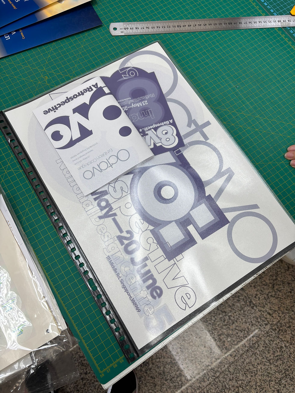
Development
The layering of typography was inspired by the screenprint tequnique of their works.
I used highlighter to simulate the overlaps.


Brochure
The insides include notable works such as albums, posters and magazines. The flipping side briefly describes what '8vo' is and the back lists their notions of design. The front cover and the back cover has a continuous key visual 8, which was a total series of magazines Octavo produced.


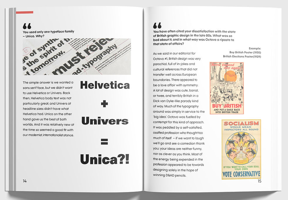
Catalogue
The catalogue '8vo: A Retrospective' is a 32 page catalogue including; the interview of Mark Holt and Hamish Muir, famous works and key design principles.
The front cover is a result of referencing my poster and re-interpretating their style.
I aimed for a coherent set of collections.



Postcard

This is a A6 postcard where I
The back shows F37 Moon and its fonts, which is an important part of their quote, using "Type as an Image." which is also mentioned on the front, displayed above the date and the location of the exhibition.
I created the space for notes at the back that is created with a set of paragraph to distinguish the importance of the type.